Designing for Collaboration
Helping people write better technical API documentation with a collaborative approach.
 APIwiz
Company
7 → 2
steps to publish
53.9%
returning visitors
RCBC · EWB
banks onboarded
Project Overview
Objective. Design one place where developers and technical writers write API docs together, so docs publish faster and doc-related support queries go down.
- Industry
- B2B SaaS · Developer tools
- Platform
- Web & mobile
- Tenure
- Dec 2024 – Nov 2026
- Tools




- Team
 Devesh (me)Lead Designer
 ShaneGTM Lead
 RashmiProduct Marketing Manager
 AnuragDesign Mentor
 NilanjanaCommunication Designer
 ShashilEngineering Lead
- LLavanyaFrontend Engineer
 BinitFull Stack Developer
 ShobhitFull Stack Developer
What I delivered
- Owned the product's design and direction, end to end.
- Researched the problem with writers, developers and PMs.
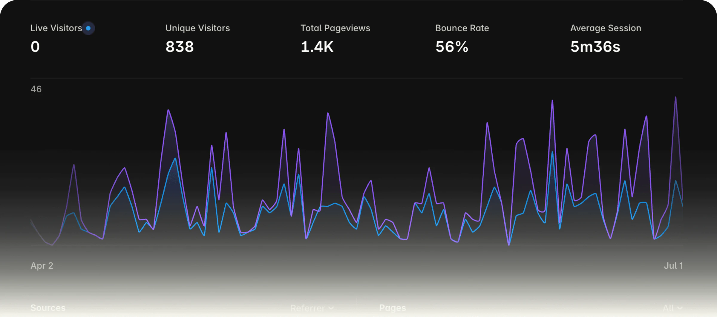
- Shipped the MVP. 838 people used it in 3 months.
- Tested it with 7 real users and found the patterns in what they said.
- Redesigned it around those patterns, adding AI features built with Claude.
- Owned the outcomes. Publishing went from 7 steps to 2, and enterprise banks signed on.
- Created the launch content, on camera and in motion.
What APIwiz does
APIwiz
APIs are how one app talks to another. APIwiz is an ecosystem of tools that big enterprises, like banks, use to work with their APIs.

Docuwiz · part of APIwiz
The documentation tool in that ecosystem. Teams write the guides for their APIs here and publish them, so developers know how to use them.
01Problem Framing
Why API Docs Fall Behind The Code
Modern software moves fast, but documentation doesn’t. Code lives in Git. Documentation lives somewhere else. When code changes, docs often don’t follow.
This happens mainly because of an ownership gap. Developers don’t see docs as part of their job, and writers don’t have the context. So the gap keeps growing.
The Goal: One Place For Developers & Writers To Write Docs
Design a place for developers and writers to collaborate on docs.
For Users
Make docs faster to publish.
For Businesses
Reduce doc-related support queries.
Hypothesis
Docs and code stay synchronised → Accuracy increases → Customers always get updated information → Support tickets go down.
02User Research
Why Writers, Developers & PMs All Struggled With Docs
We interviewed users to understand what existing tools fail to solve for, focusing on their day-to-day challenges, rather than jumping straight to which features to build.
Technical writers
Writers bring clarity, but can’t write without collaborating with developers or product managers.
Developers
Devs hold the accuracy, but don’t see documentation as part of their job. They just move on to the next sprint.
Product Managers
Managers know the business, but it’s one of many competing priorities, so context trickles in too late.
Dev Tools
Tools only focus on formatting instead of collaboration, and iterative writing approaches.
What Each Persona Needed From The Product
Based on the user insights, we mapped what each of these personas actually needed to get their job done.
- For writers
Provide a structure and feedback loop.
Clean, block-based editing, structured writing support, continuous feedback loop.
- For developers
Design an easy way to get doc live.
Simple setup journey, sync code with docs, preview, publish, and hosting.
- For manager
Allow them to keep the docs accurate.
Track changes across, verify specs against real flow.
- For dev tools
Facilitate a collaborative approach.
Make it easier for teams to collaborate on the documentation process.
These Conversations Convinced Us To Build An MVP
Talking to all four groups was our first round of testing. It gave us the instinct that we were on the right track, building something people might actually buy, especially big enterprises. So we built an MVP to find out.
03MVP Design
An MVP That Syncs Docs With Git, Built To Test With Real Users
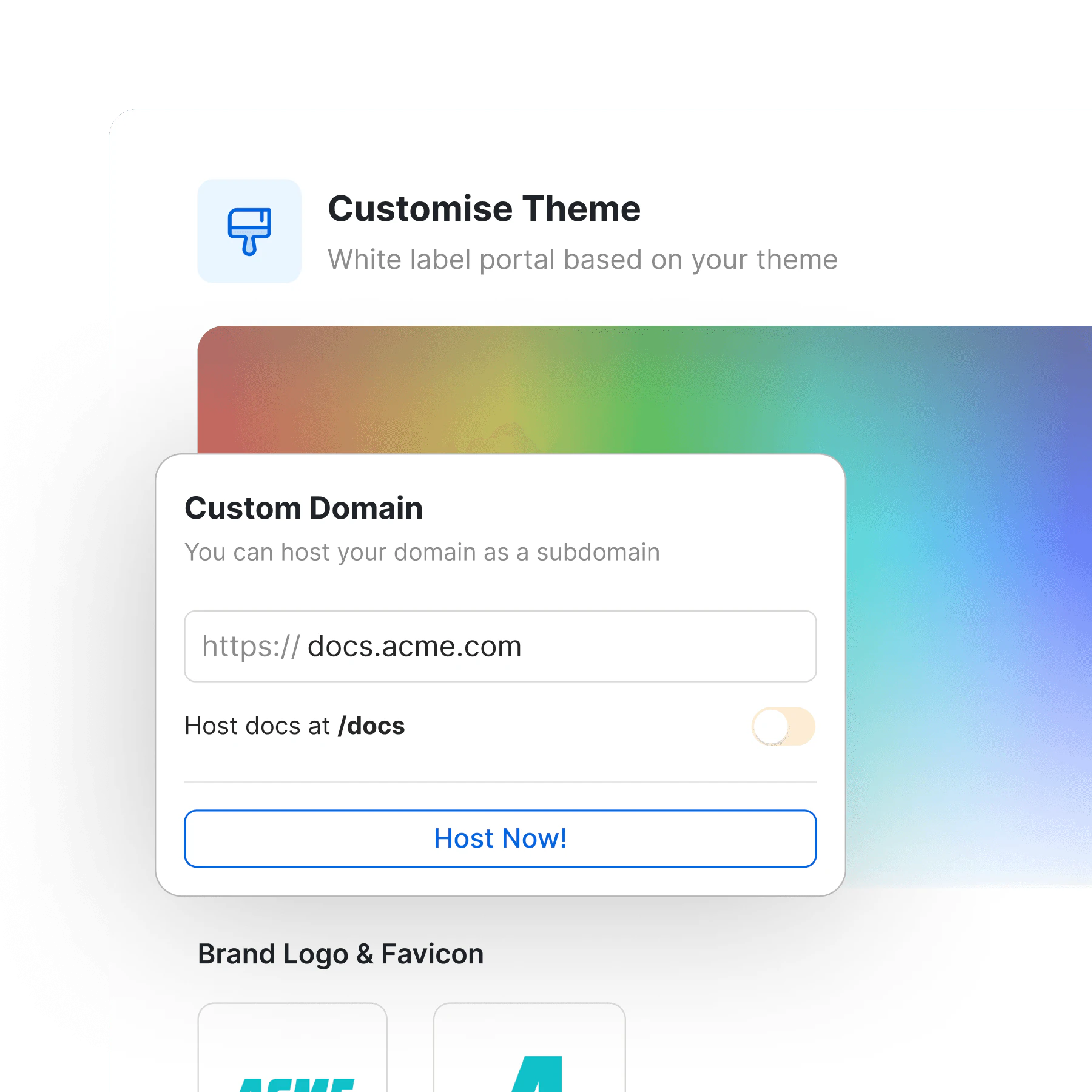
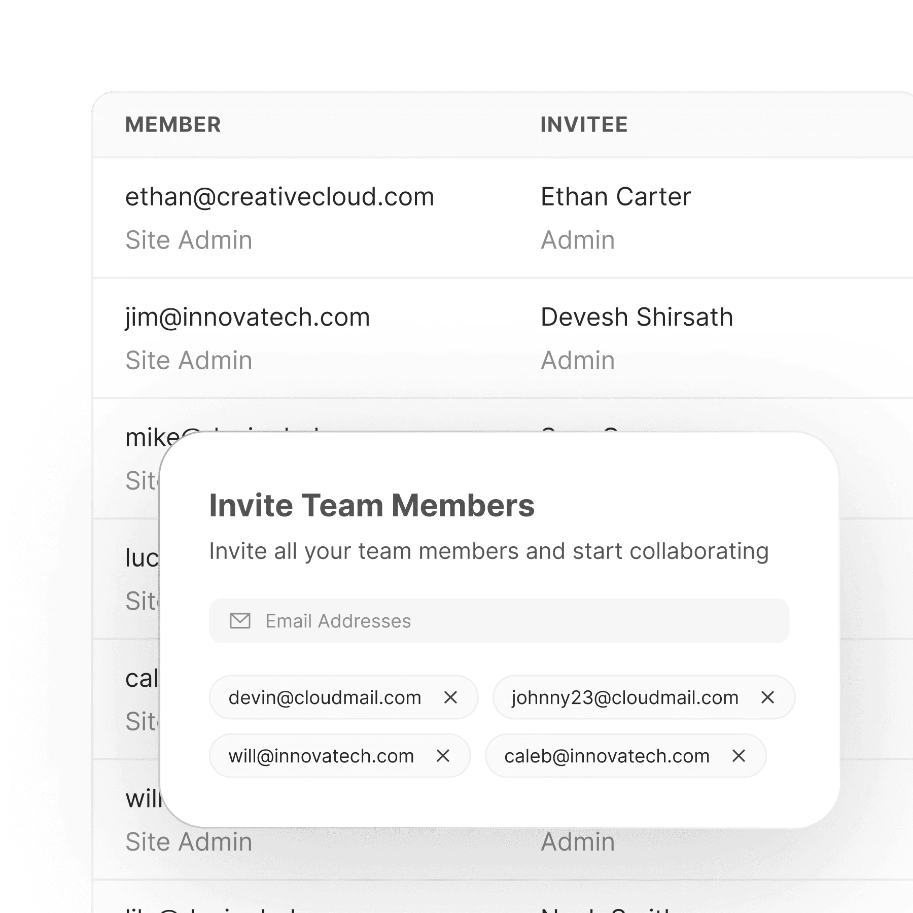
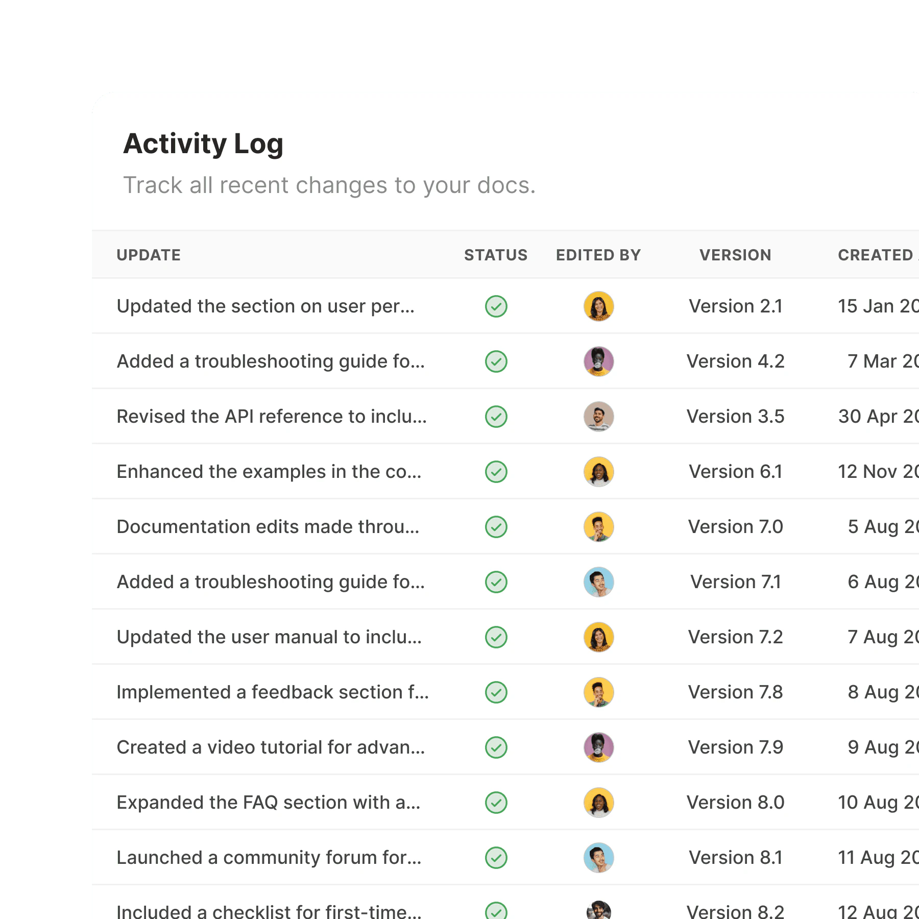
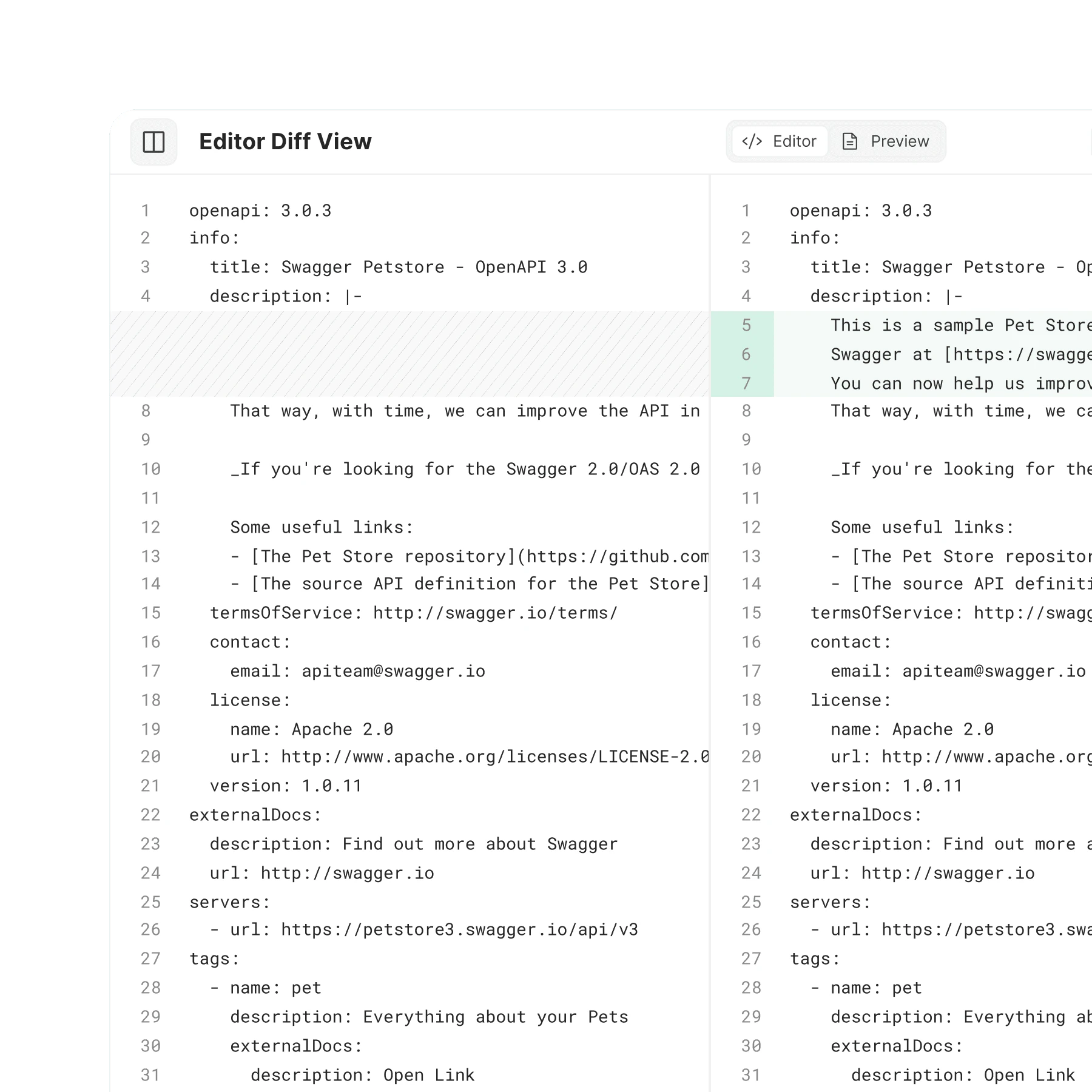
Built an MVP with a simple goal: plug docs into source control and host them on DocuWiz. But this was really a testing phase, the primary intent was to make something real enough to get litmus-tested by actual users.
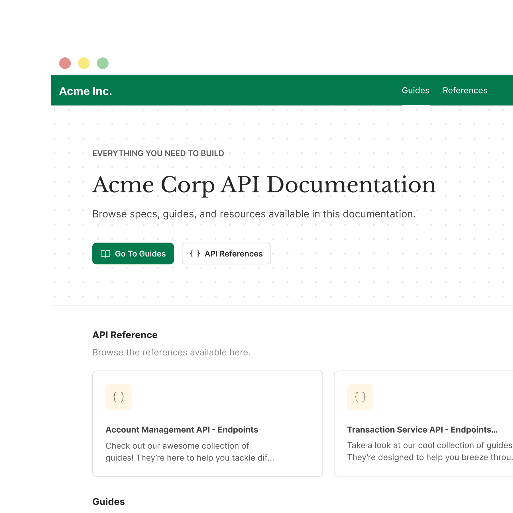
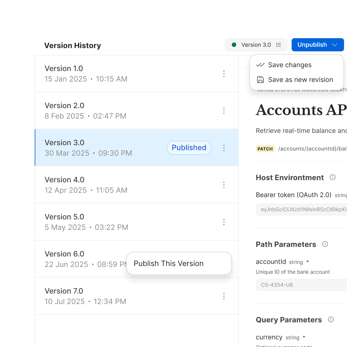
838 People Used The MVP In Its First 3 Months
04Usability Testing
Testing The MVP With 7 Real Users
Team gathered user feedback on MVP. I learned that no amount of synthetic personas or simulated user research replaces the insight you get from watching a real person struggle with your product.
Testing Pool Size
7 Users
What I did with feedback?
- Collect Users’ QuotesWhat they said vs what they need.
- Find PatternsFind the points that came up most.
- Prioritise & FixWeighed impact against effort, then built.
What Testers Told Us, In Their Words
I documented their feedbacks into quotes to understand what they are asking for.
“docuwiz appears to publish without my explicit request/consent. This should be corrected (very high importance) to establish trust.”
 David BiesackPrinciple API Architect
“Importing the Petstore spec failed with 'Please Resolve Errors before generating' despite 0 errors.”
 Vladimir GorejSenior Software Engineer (AI)
“when importing a YAML OpenAPI spec — a format the product explicitly states it supports — the Uploaded Files page displays OAS VIOLATIONS: ”
 Gale JamesSenior Technical Writer
“a component gallery or documentation playground and dark mode. Both are calls for surfacing what already exists more than building net-new”
 Avinit ChakravartiDeveloper
“By step five of the onboarding flow, I had not built anything.”
 ShaneDev Tools (Growth Manager)
The Feedback Pointed To 4 Problems
I found the points that came up most often across all the feedback.

Onboarding
The flow assumes users arrive spec-in-hand. Three independent feedbacks — too many steps before any output, a buried CTA, and no fallback for anyone without a spec file ready.

Error-State Transparency
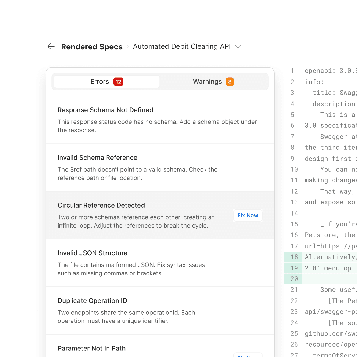
The interface tells the user something happened, without giving them the information or control to act on it.


Feature Discoverability
The design hides capability that already exists. Rated 3/5 — "clean and modern but too minimal" — with the biggest blocker named directly as discoverability, not missing features.
AI Feature UX Friction
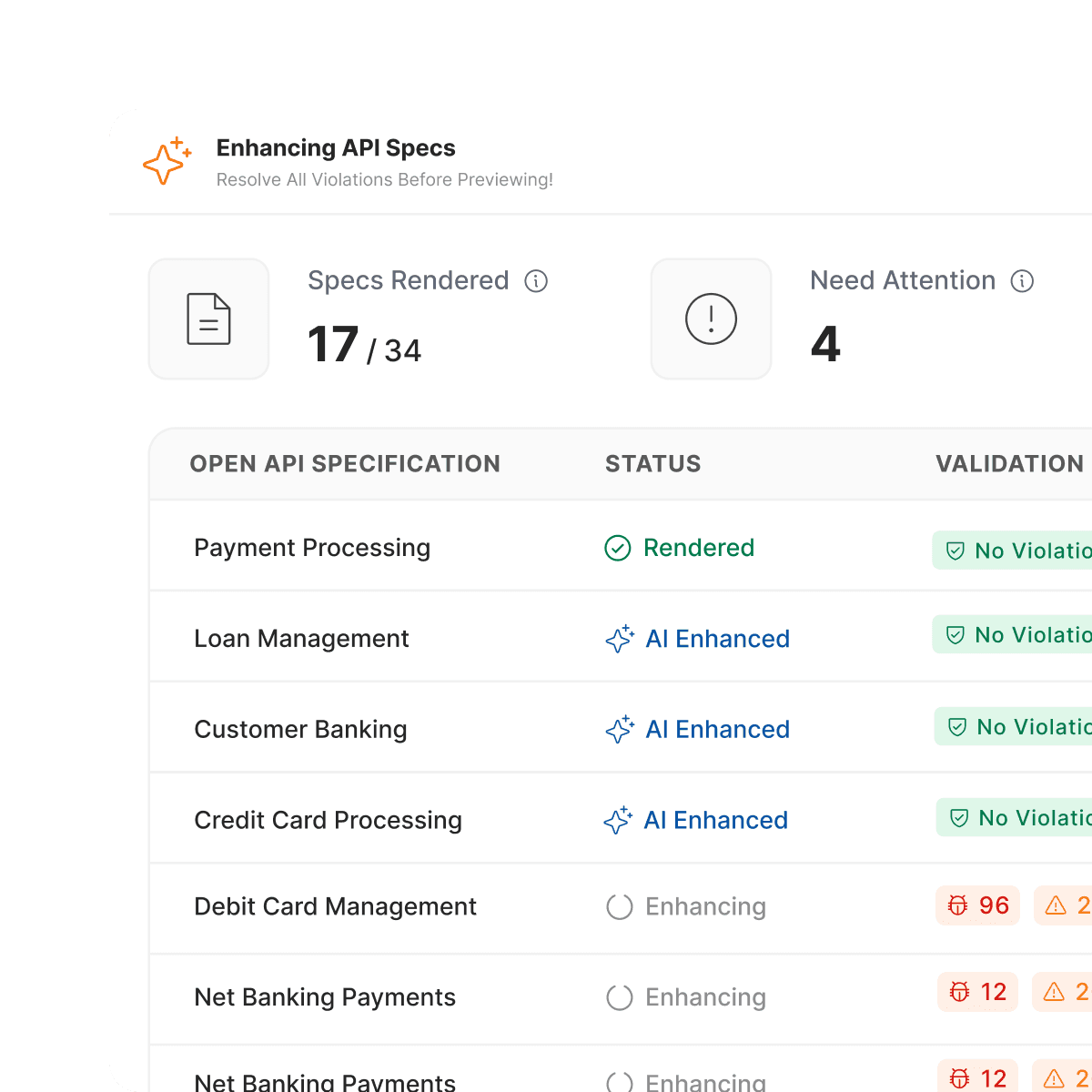
The AI-enhancement entry point dead-ends with a blocking dialog, inconsistent labeling between screens, and no consistent way to find the feature again once past initial setup.
What Users Wanted Needed: Control Over Publishing
Instead of taking feedback as it is, we dug into the root cause, checking it against our original hypothesis, and planned action from there.
Course correction
Example 1
“If i have not published anything yet, how come the dashboard says view published site”
- Original hypothesis
- Loading sample specs will allow users to avoid the setup part and directly take them to the published landing page.
- Problem
- Sense of accomplishment missing.
Lack of control. "As Avinit said: I didnt publish anything yet, then why is it saying "View published" - Possible solutions
- We need to introduce a clear publishing moment in the flow. Give them a sample spec, error free warning free, and let them upload and publish it... its a handson, sureshot way to show them how it works.
Course correction
Example 2
“If I don't already have a spec file handy, I am completely stuck.”
- Original hypothesis
- Built for users who want to see the end outcome in one click, without touching the dashboard at all.
- Problem
- Didn't account for trust or control, the shortcut felt like something happening to the user, not something they did.
- Possible solutions
- Rename the CTA to "Publish Now." Keep the one-click convenience, but only trigger publishing on that click — so the user owns the outcome.
Turning The Problems Into 3 How Might We Questions
Based on the problems we saw with our hypothesis, we started brainstorming solutions.
- Make the first action obvious?
- Let users see value before uploading doc?
- Show users everything the product does?
05Design Iteration
Prioritising Fixes By Impact vs Effort
Due to limited time and resources, we had to prioritise what to solve and place our product accordingly. For that we mapped Impact VS Effort chart.
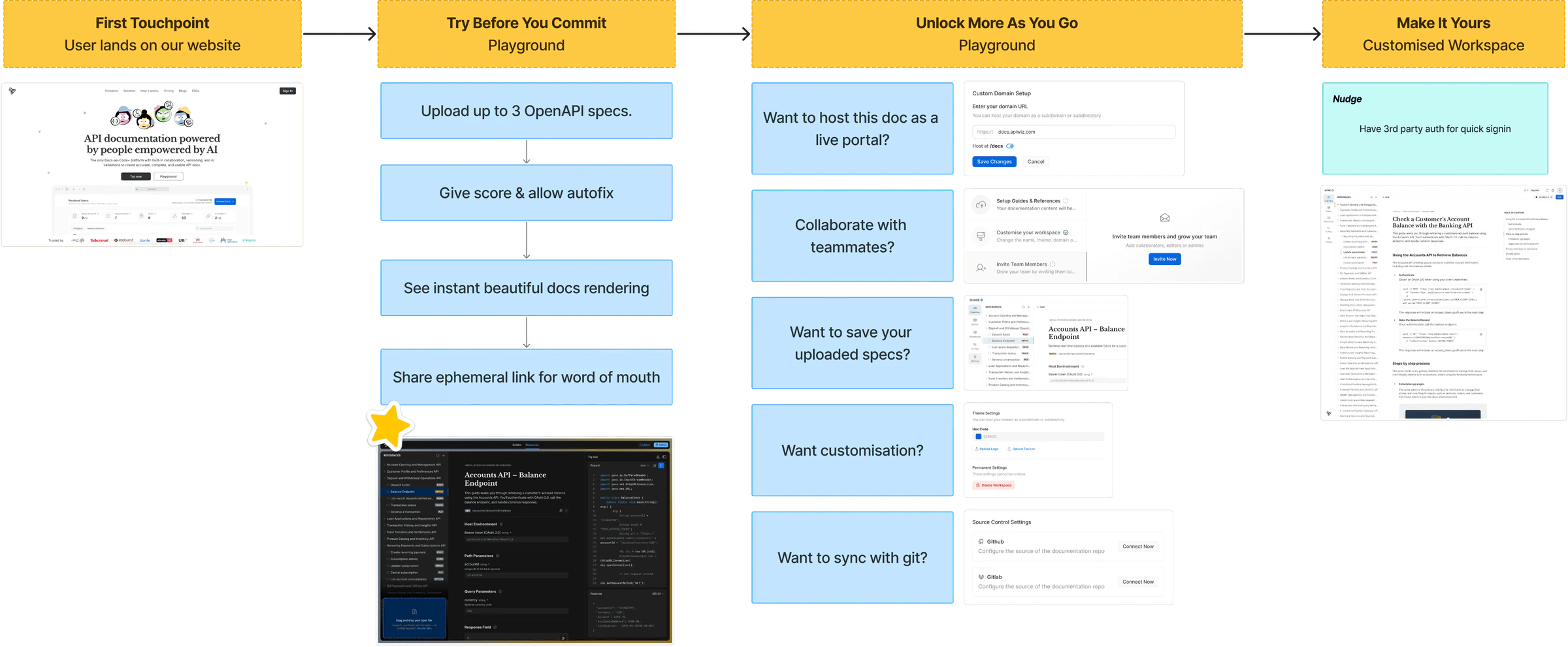
The User Journey, Reworked After Feedback
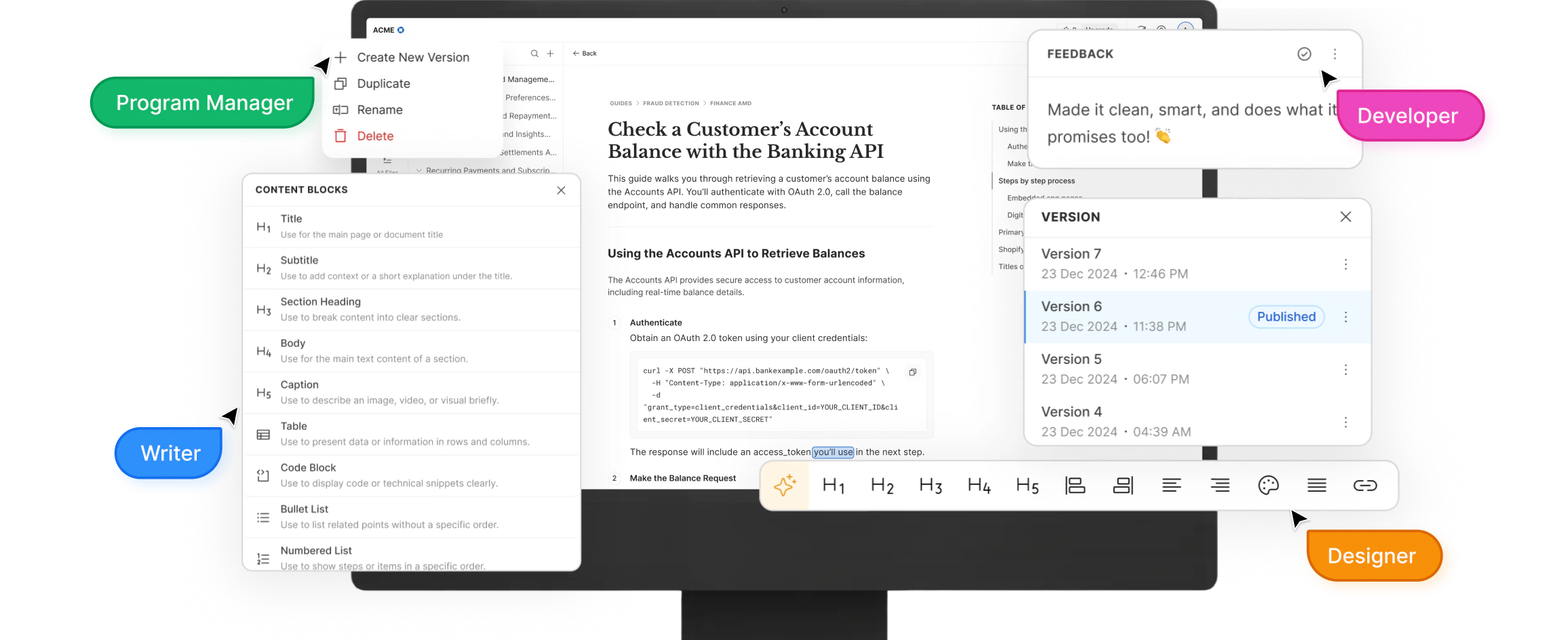
How Did I Design The Guide Editor, Block By Block?
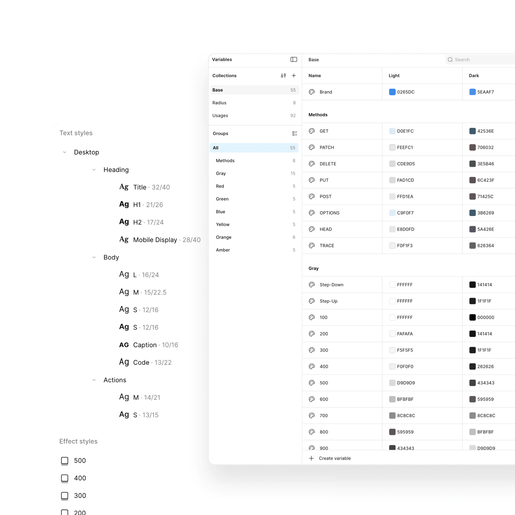
I didn’t design the guide page as one big screen. I designed the smallest blocks first, a line, a paragraph, headings, code, a step, and made each one behave on its own. Then I put them together, and the full guide came out evenly spaced.
- Type stylesThe styles every block is built from.
- Line blocksSingle lines of text, the smallest unit.
- Alpha blocksParagraphs, with a + to add and a handle to move.
- Beta blocksContent with its H1, H2 and H3 titles.
- Code blockA tab per language and a copy button.
- Step componentAdapts to an image with a caption, or text and bullets.
- Block menuType / and pick what to add next.
- The full guideEvery block put together, evenly spaced.
What We Launched: Activation Journey, Commenting & Templates
Feedback from early users revealed where the experience broke down, helping us reshape flows to reduce friction and guide users toward meaningful outcomes.
“I have signed up, now what do i do?”
We shifted our thinking from “exposing features” to actively guiding users toward success using activation journey.
“How do I collaborate with my team?”
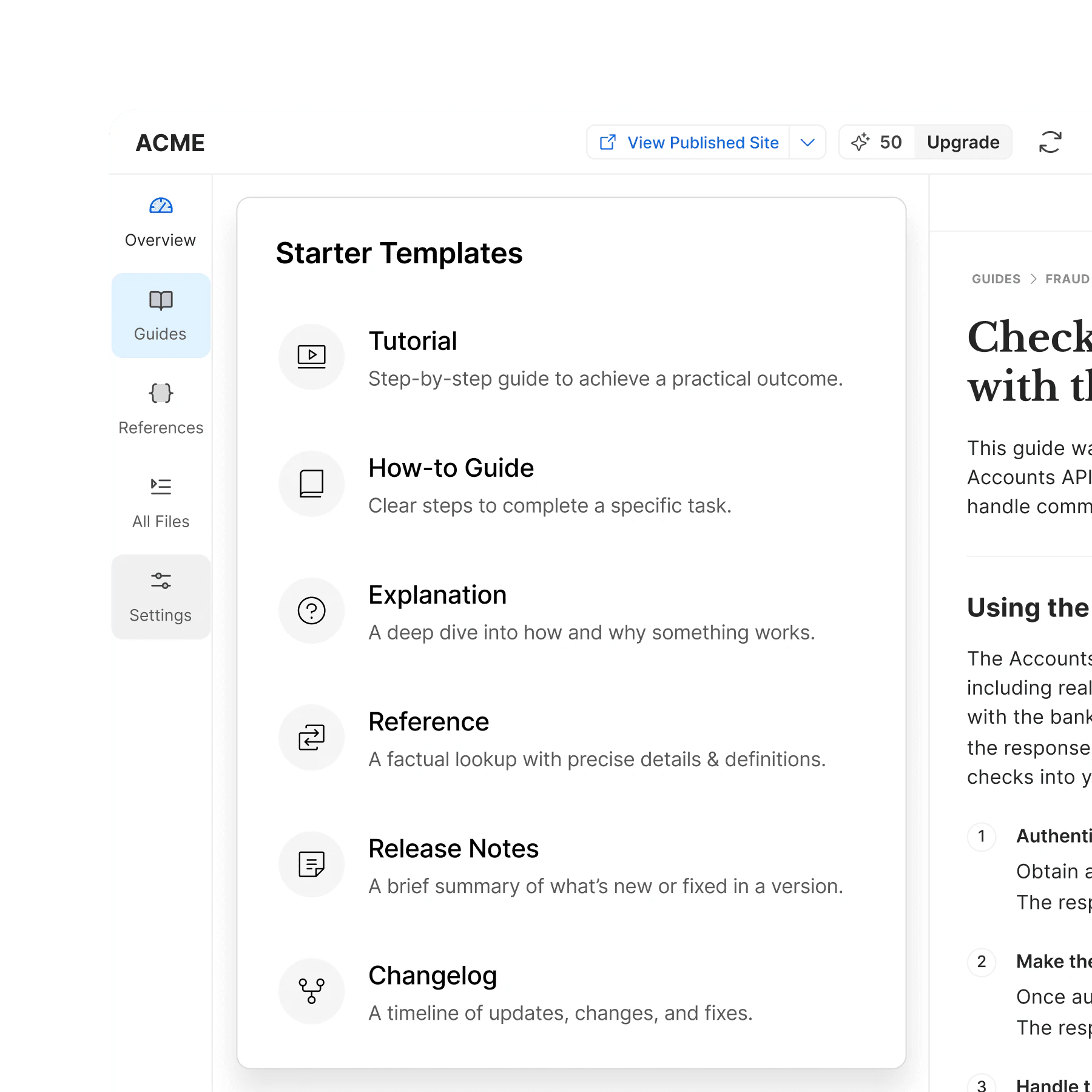
We introduced inline commenting and file attachment to facilitate collaboration between devs and writers.
“I don’t want a blank page to start with”
Templates give users a clear starting point, so they can focus on writing instead of structuring.
06Launch & Impact
Beyond Design: I Was Also Docuwiz’s Content Creator
Docuwiz grew product led, unlike our sales led products, so it needed content people would watch. I made it: interactive product videos designed on Jitter (including the ones on this page), webinars where I presented on camera, and feature videos posted on LinkedIn.
Content I created
- Product Videos
- Motion Design
- On-Camera Webinars
- LinkedIn Feature Videos
- User Interviews
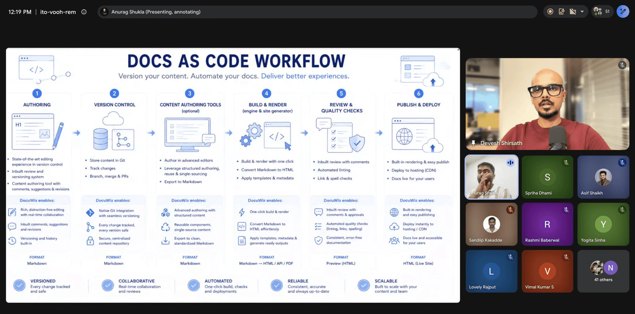
Feature videos I made and posted
Commenting: peer review and feedback inside the docsView on LinkedIn
Sync docs with source controlView on LinkedIn
Impact: 7 → 2 Steps To Publish, Enterprise Banks Onboarded 
- 72
Efficiency
Reduced the steps-to-publish, from 7 to 2, making documentation faster to publish.
Trust & Validation
We migrated our own internal APIwiz docs, which turned into a dogfooding exercise.


Adoption
We onboarded enterprise customers like — RCBC, EWB Bank.
Engagement & Reach
Attracted users from various countries, with a 53.9% returning visitor rate.
Product in action
Experience the product described in this case study.
Who Bought It, And Where We Beat Competitors
Yes, we built a community of technical writers, organised webinars to build our presence in the market. But in order to sell it we had to understand where we stood out compared to our competitors.



- Intuitive UI
- Feature Rich
- Reasonably Priced
What I Learned: Align With Partner Teams Early
Working closely with partner teams reinforced the value of shared thinking. Aligning early and often helped us create a more cohesive experience, where the product felt consistent and intentional across touch points.
What’s Next: 70% Improving, 30% Building
We’re actively collecting user feedback and pulling items from the backlog. With a strong foundation in place, the focus shifts to fine-tuning the experience, strengthening existing flows, and making the product more delightful.
70% Improving
Of our effort goes into improving existing features and user requests.
30% Building
Goes into exploring and building new capabilities.